OmaxBooks
Book cover designs
Client: OmaxBooks
Agency: 360 Creative
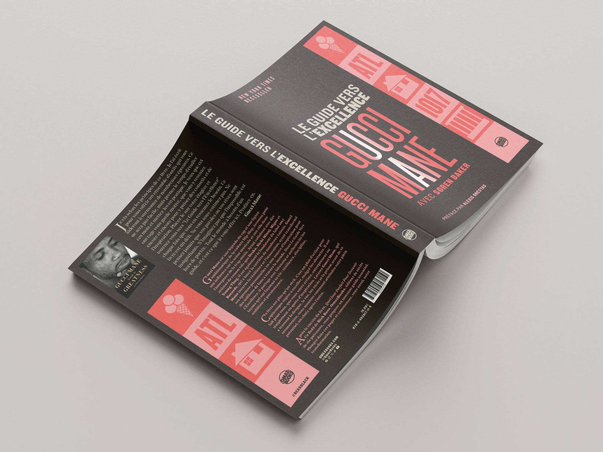
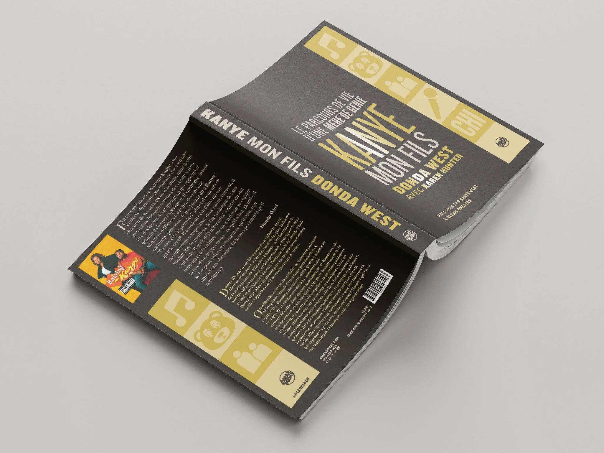
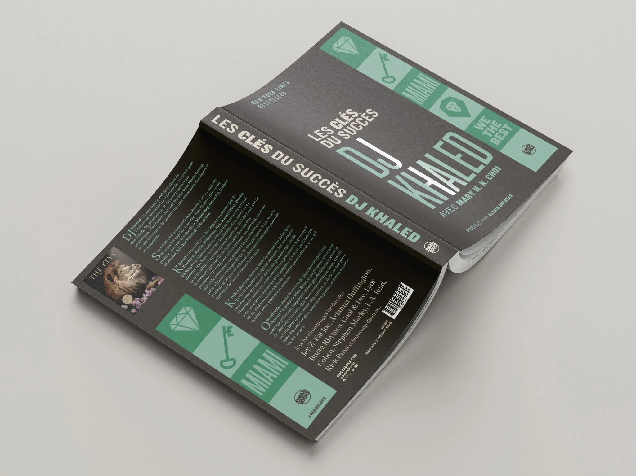
For the OmaxBooks collection, I engineered a systemic visual language that replaces traditional portraiture with semantic iconography. Each cover functions as a decoded biography, utilizing custom-designed pictograms to represent the subject’s geographic origins, cultural milestones, and personal motifs. The icons are the result of research into the subject’s history, iconography, and discography, ensuring the visual keywords are authentic to the narrative.
This approach ensures that the Omax brand maintains a modernist, high-impact presence in the French-speaking literary market.
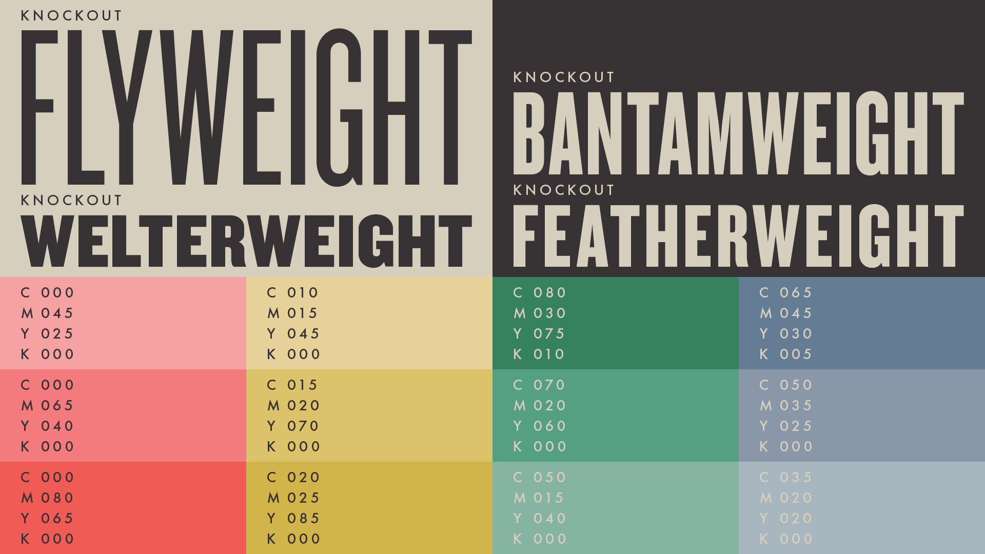
Typographic hierarchy: I utilized the Knockout font family, leveraging its extensive range of widths and weights to manage varying title lengths while maintaining a stable structural anchor across the series.
Color logic: The collection utilizes two base tones - greige and ebony - paired with specific ranges of yellow, red, blue, or green to differentiate titles while signaling a unified collection identity.
Typography & color palette

Donda West
I specified a UV spot varnish for both the title typography and the icons, set against a matte laminate finish. This creates a play of light and texture that emphasizes the tactile nature of the covers when physically handled.

DJ Khaled

Nipsey Hussle


Gucci Mane