Levallois Metropolitans
Sports team identity & brand architecture
Client: Levallois Metropolitans
Agency: 360 Creative
For the Levallois Metropolitans, I engineered a comprehensive rebranding that bridges the gap between professional basketball and the industrial history of Paris. I moved the team away from its traditional navy/yellow color scheme toward a high-contrast yellow and black palette to achieve a minimal, industrial aesthetic that commands authority on and off the court.
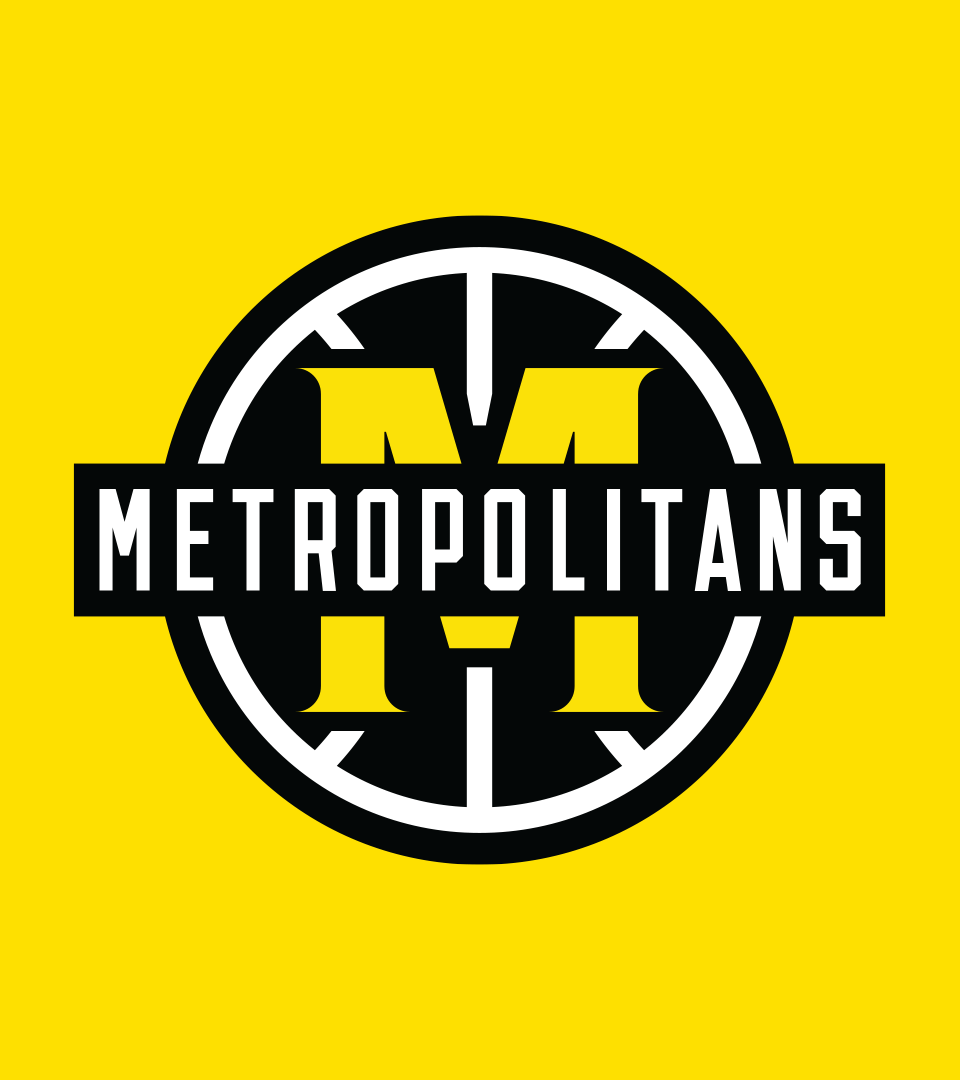
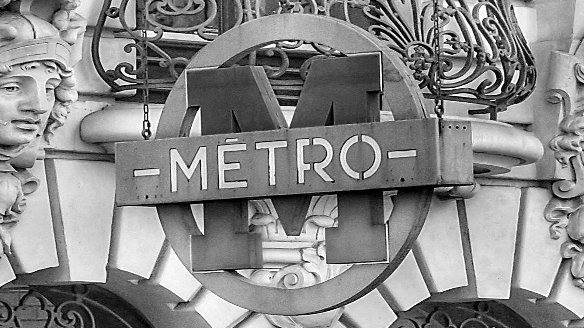
I developed a minimalist “M” that references vintage, cut-out metal Paris Metro signage, creating a mark that feels forged rather than merely drawn.
Team monogram
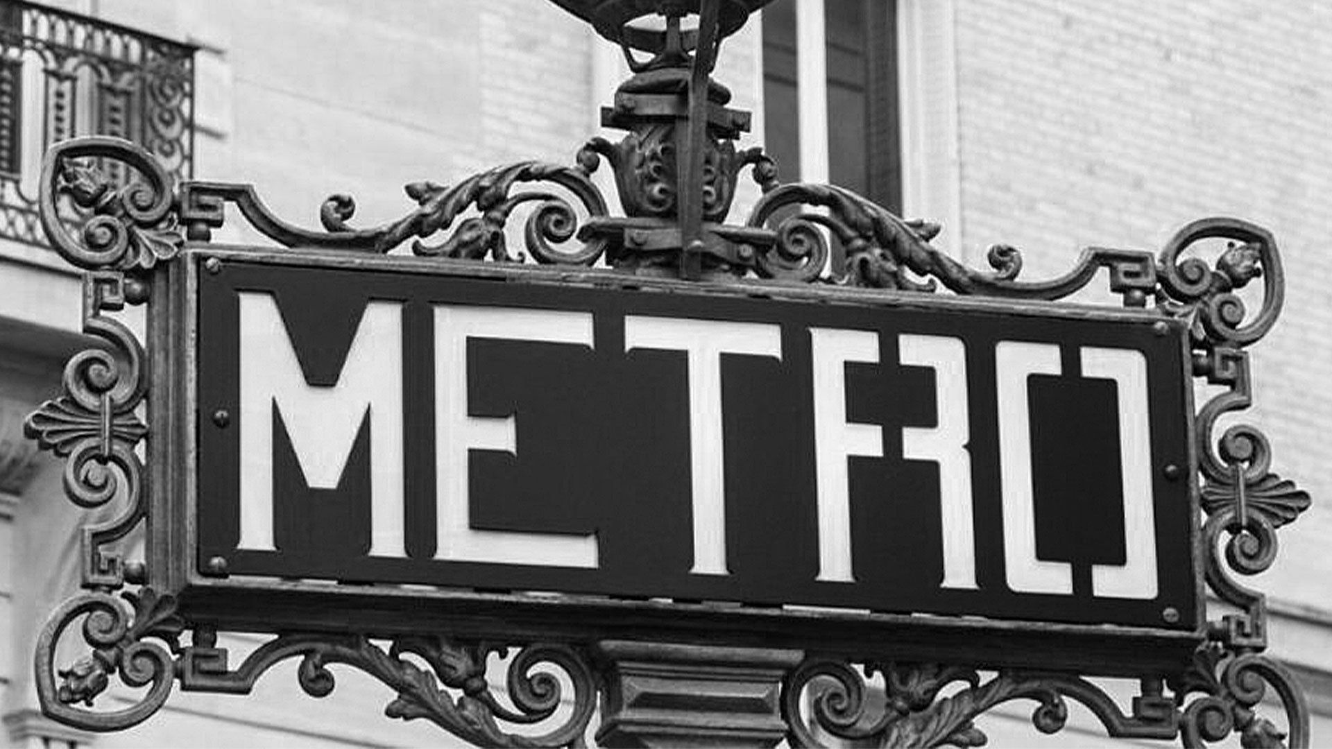
The project includes an ”inspiration archive” that deconstructs how specific Metro sign-cutouts and tile geometries were translated into the modern team monogram and wordmark
Heritage documentation
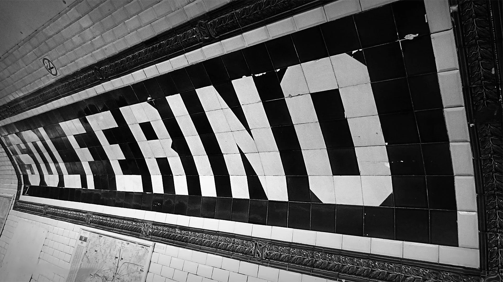
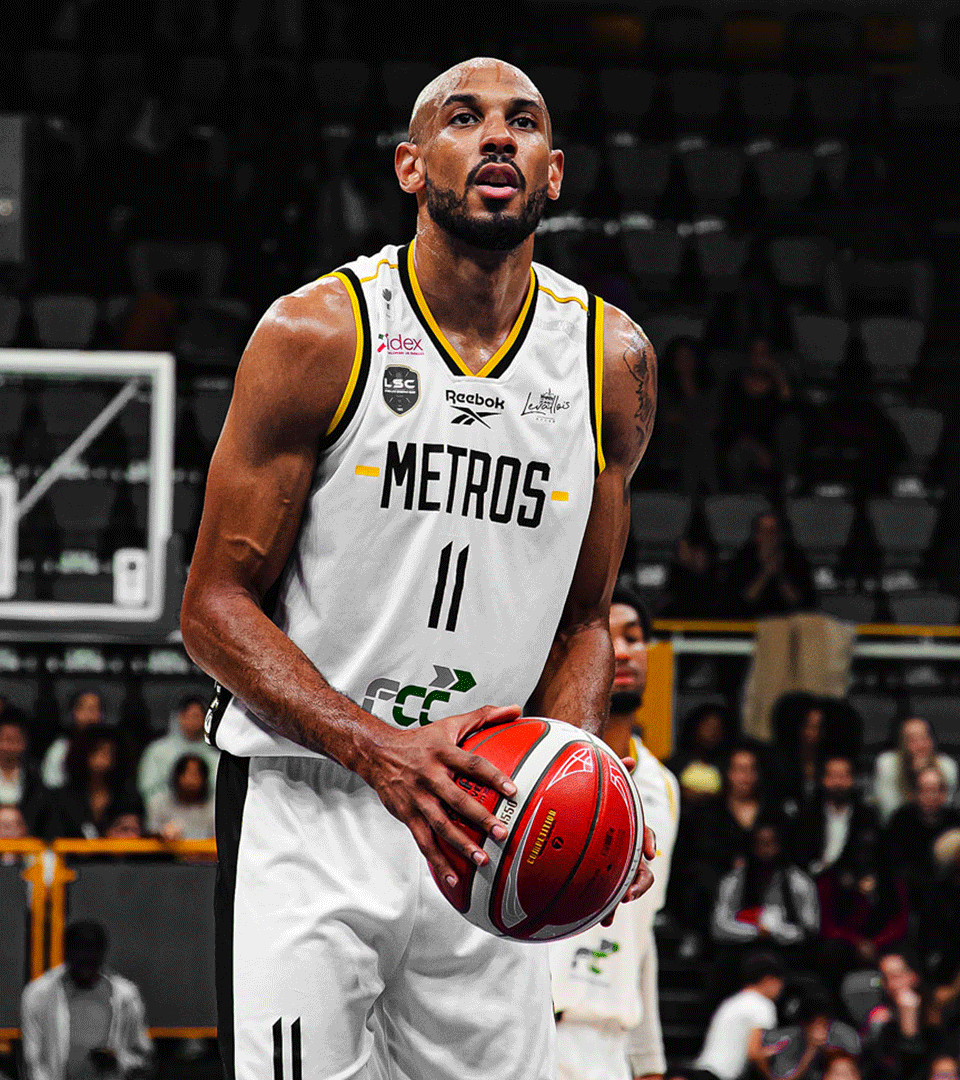
I engineered a bespoke wordmark inspired by the iconic ceramic tile lettering found in some historic Metro stations. This ensures the Metropolitans name is rooted in the city’s specific architectural typography.
Team wordmark
I designed a complete set of bespoke numerals. These characters utilize a sharp, geometric silhouette that maintains a stencil-like industrial feel while ensuring maximum legibility.
Bespoke jersey numbers
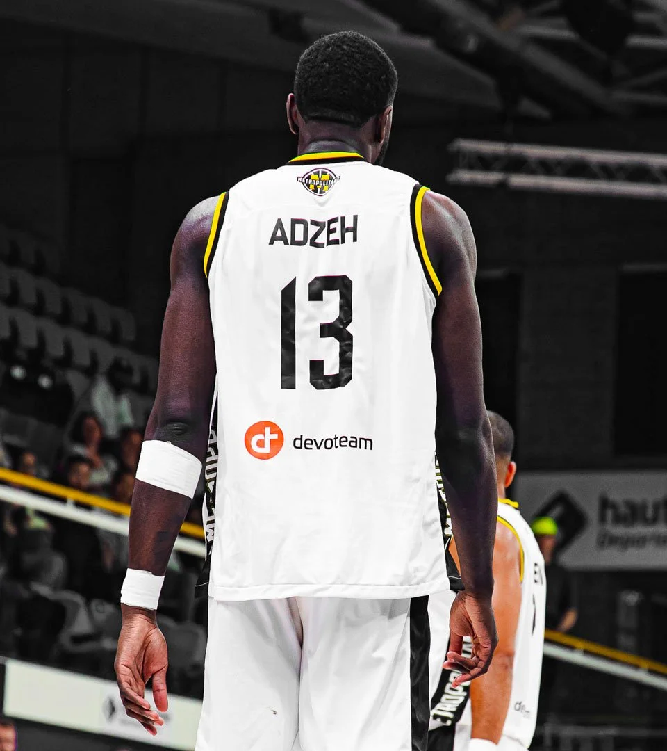

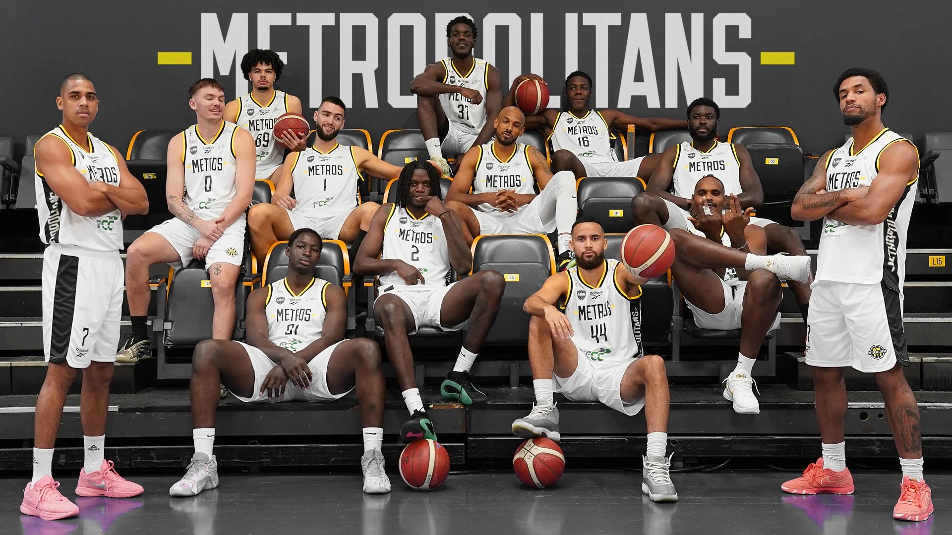
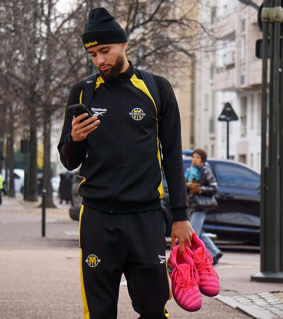
In partnership with Reebok, I oversaw the translation of the franchise’s visual identity into a comprehensive apparel range. My role involved providing precise design intentions for the technical manufacturing of match jerseys, training kit, and staff equipment, ensuring that the brand’s aesthetic was maintained across all textile substrates.
Player jerseys
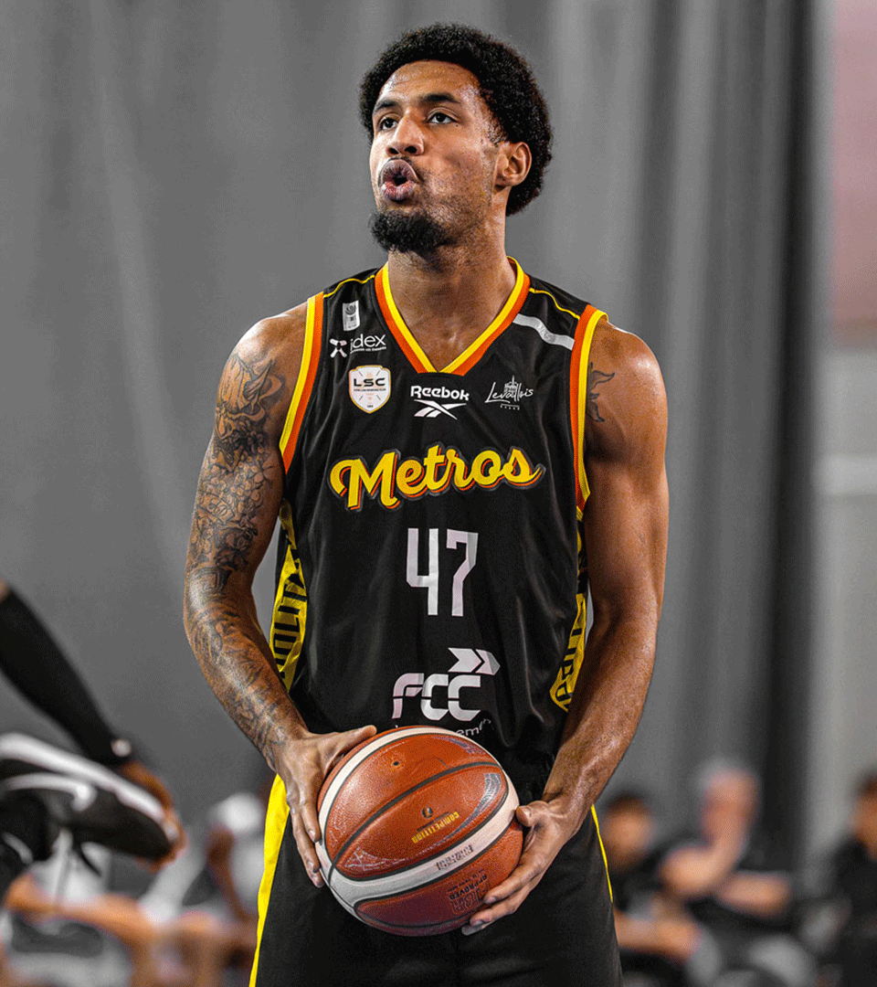
The design intentions extended beyond the court to include training and staff kits, creating a unified institutional image. By utilizing the gestural scriptmark alternative for lifestyle and training components, we achieved a balance between professional athletic rigor and modern streetwear influence.
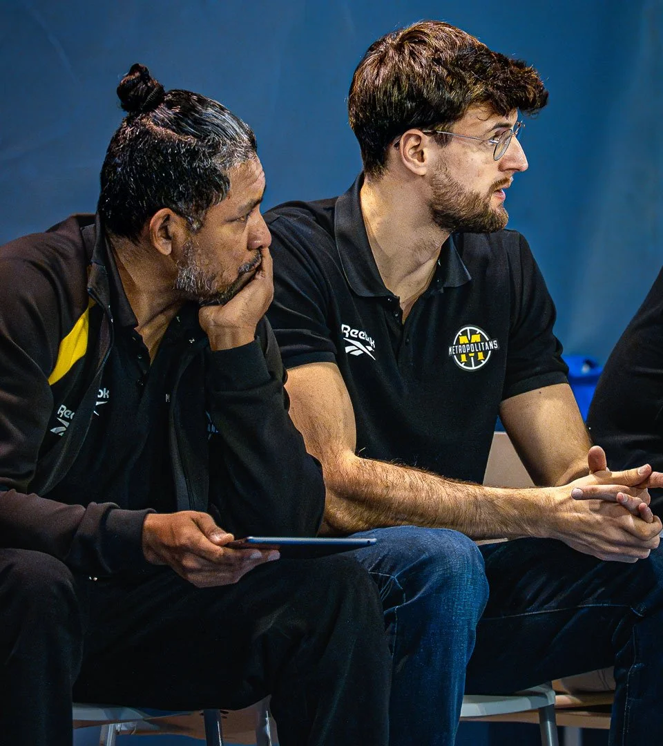
Staff & training kit
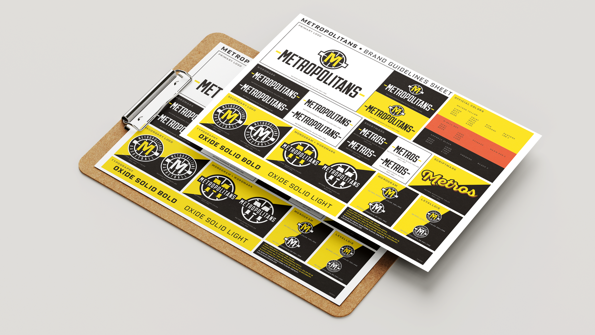
The franchise’s brand architecture is governed by a modular system designed for maximum visual contrast and resilience across all physical and digital touchpoints. This suite of assets ensures a unified voice, maintaining integrity from large-scale stadium takeovers to micro-scale apparel details.
Monogram + wordmark lockup: The primary signature utilizes a vertical alignment, anchoring the crest above the custom-drawn Metropolitans lettering.
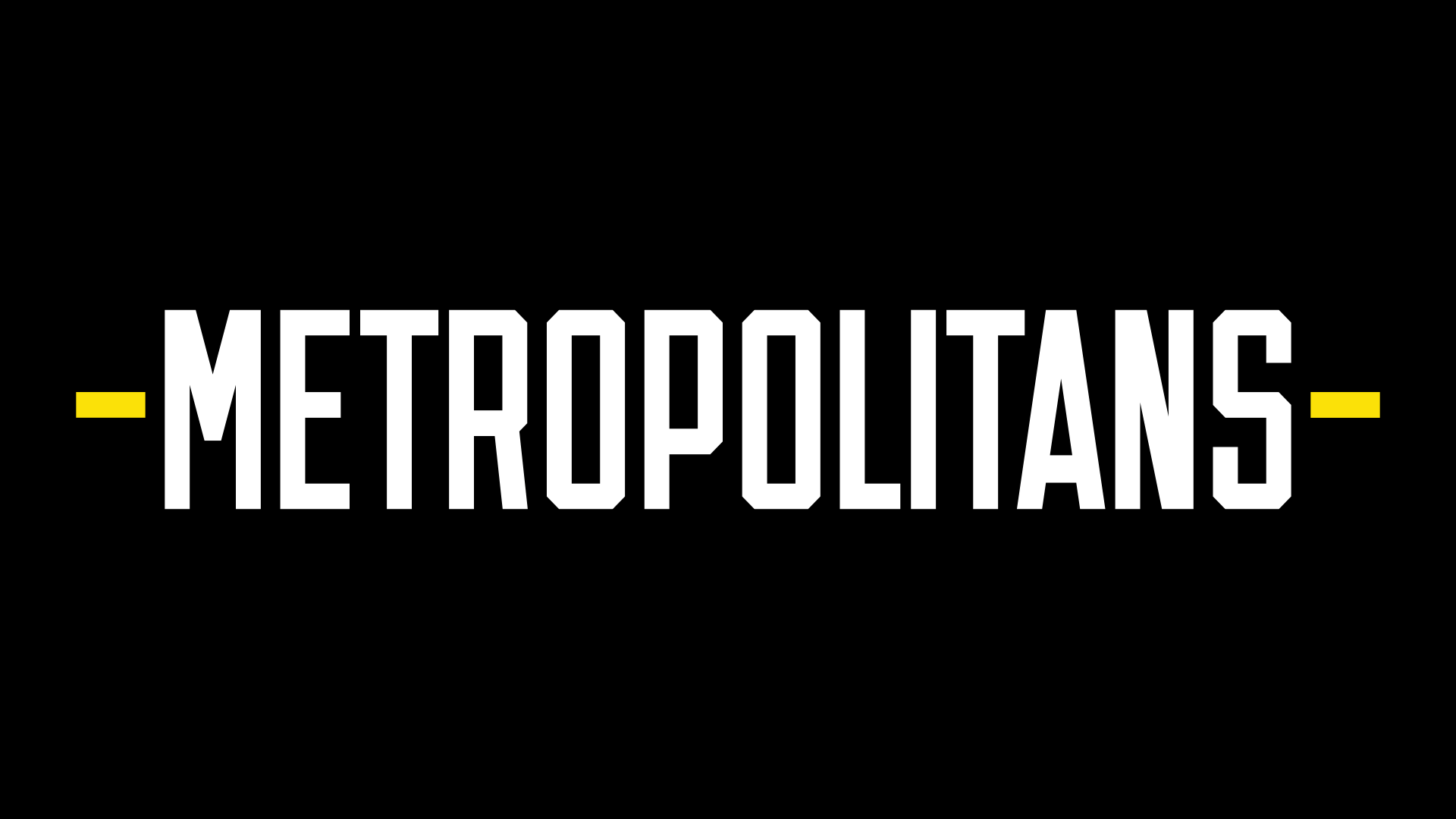
Long & short wordmark variants: To ensure architectural flexibility, the system includes the full Metropolitans wordmark and a condensed Metros shortmark for restricted spatial applications.
Scriptmark alternative: A secondary scriptmark provides a fluid, gestural counterpoint to the rigid geometry of the primary marks, suitable for lifestyle and editorial contexts.
Comprehensive brand package